Our Latest Blogs

Our Solutions News Blog was envisioned to gather and share information from the very best to help you and your business to become more effective.

image
One key part of being a great marketer is understanding how people think and knowing why they act the way they do. 10 principals.
image
Which Social Network Should You Advertise On? Social media advertising is a great tactic to use to supplement your print advertising.

Displaying items by tag: Marketing

Thursday, 28 July 2022 11:55

It's Good to Get Some Perspective

Are they looking up to you and your graphics? Keep scale and readability in mind with these design tips... Print offers more ways than ever to remind people why they like you, need you and should keep paying attention to your business. We can help.

Woman Looking Up

When designing your large format signage, one of the most important factors to remember is the perspective from which people will view it. Images that are higher above attendees will appear different than those closer to ground height. This may affect the placement of images and text and what you want to be emphasized on your banner. Designs that are too complex or messages that aren’t clear are likely to get lost the further they are away from the ground.

Large graphics must awe their audiences and remain visible at a distance, influencing what sort of colour and imagery you utilize.


Does it pass the squint test?

It is essential to understand how the distance between a piece and its audience affects the message. One trick to simulating the effect distance has is to squint while you view it, effectively cutting down on the contrast and detail. It will be clear at a distance if it's clear and readable through a squint.


Keep up the contrast.

The contrast between the foreground and background plays a role in readability. The higher the contrast, the easier it will be to read.


Keep fonts simple.

Tests have shown that modern sans serif typography is best for anything that will be read from a distance (think road and traffic signs). But that doesn't rule out the careful use of serif typography. Keep the point size large and avoid setting it in all caps—experiment by adding letter spacing and leading until it passes the squint test.


Fewer words, bigger type.

The farther the viewing distance, the fewer words you can use. Billboards work with a 12-word rule, and large graphics are similar, especially if the audience is moving. Use a QR code or reference a website page when more information is needed.

- - - - - - - - - - - - - - - - - - - - - - - - - - - -

Please contact us for free information, tips and assistance!

Written By: Trent Ainsworth / Source: Beeline

Monday, 13 June 2022 12:38

With Good Copy, Direct Mail Drives Results

Print and Direct Mail offers more ways than ever to remind people why they like you, need you and should keep paying attention to your business....

Direct Mail Drives Results

In the previous blog post we went into the 3 basics of any direct mail marketing process you may choose to create, including:

    » Audiences to mail (beyond just demographics)
    » How to draft your offer
    » Designing for revenue

Today we give you the 4 key pieces that make up the reason people will take action from your mailing.

First, let's talk about the basics of effective imprint advertising and writing effective advertising: Headlines, Subheads and Image Captions.

The first critically important key is the development of effective Headlines. The headline is the most important component of any type of imprint advertising. It must work or nothing else matters.

Next in import are the Subheads, which are used to break up long blocks of copy.

Lastly are photo captions. Photo captions are marvelous opportunities to make persuasive arguments. People are drawn to pictures and often read the captions beneath the pictures before reading just about anything else.


The same basic guidelines applied to headlines, subheads, photo captions…

First, the headline should promise a positive benefit or ask a provocative question or both.

Second, it should telegraph its message in 12 words or less.

Third, it should stand alone, meaning it should make a complete statement by itself.


That's two thirds of the success formula: Headlines, subheads and photo captions are the critical ‘attention getting’ and ‘interest building’ components of imprint advertising, supported by good effective copy. The third part is the call to action in the form of a response device.

In person-to-person professional selling, one of the most common failings in salespeople is the fear of closing the sale, the reluctance to ask for the order.

Master sales trainer Zig Ziglar says that, “Asking for the order is what separates the poorly paid professional visitor from the Kingly Compensated Professional Sales Person.”

Just as closing the sale is a vital skill in face-to-face marketing, asking for the desired action clearly is a vital skill in advertising.

Incidentally, experience in effectively closing sales in person is a valuable asset in creating effective advertising. The same techniques, words, phrases and ideas used in personal selling can be used in print selling.

A strong direct call to action in direct mail is vital. Tell the reader exactly what you want them to do, how to do it, and when to do it. If response to your offer is in any way complicated, you may want to number the instructions; One, two, three.

The call to action may appear in several places in the typical direct mail package, such as the letter or in the main brochure.

And most importantly is the response device. A response device is the coupon to be redeemed, the order form or the reply card. Whatever your response device is, it should restate the basic offer and bonus and present the call to action.

These four keys are pivotal to generating a proper response from your direct marketing materials: Headline, Subheads, Picture Captions and the Call to Action.

- - - - - - - - - - - - - - - - - - - - - - - - - - - -

Please contact us for free information, tips and assistance!

Written By: Dan Kennedy / Souce: Magnetic Marketing

Published in More Success
Friday, 20 May 2022 12:48

Direct Mail Drives Action for Your Brand

Canada Post gives you a powerful and effective sales force at a bargain price. Using the postman as your salesman via direct mail advertising is a great bargain. And one of the most effective marketing strategies available to most businesses, direct mail gives the marketer tremendous control over the sales process...

Direct Mail Drives Acion

Properly used, direct mail and following direct mail principles can be one of the most effective and cost efficient marketing strategies you'll ever find for your business.

Here are the 3 basics of any direct mail marketing process you may choose to create:

  • Audiences to mail (beyond just demographics)
  • How to draft your offer
  • Designing for revenue

People should also compile their own mailing list beyond just demographical outreach.

For one thing, you should maintain an up to date mailing list of all your customers and clients. Direct mail can stimulate additional business, introduce new products and services or promote sales or special offers.

--------------------------------------------------


For one thing, you should maintain an up to date mailing list of all your customers and clients. Direct mail can stimulate additional business, introduce new products and services or promote sales or special offers.

You can also build prospect lists of your own in many different ways. If people call your business for information, your staff should be trained to get the caller’s name, address, and email. If you exhibit at trade or consumer shows, you might use a free prize drawing or some similar method to obtain all the show attendees’ names and addresses.

You can also compile your own list from business directories, chamber of commerce directories, association directories, and other similar sources.

Success is found in repetition. You should think in terms of mailing offers and information to the same list 3-5 times during a 12 month period, not just once.

The list or list selection is the starting point of the direct mail marketing process. Then second comes the development of a matching offer.

The offer you make in a direct mail package needs to be carefully thought out and matched as closely as possible to the interests, needs and motivations of the list. And as a general rule of thumb, the more specifically matched the offer and list are the higher the response rate.

--------------------------------------------------


I want you to understand that it is not necessary or even advisable for you to engage the expensive services of graphic designers or ad agencies to create your direct mail pieces.

If you will make the format decision yourself, write the copy yourself and provide some graphic components yourself, then you have your piece prepared by printer that provide direct mail handling services.

An ad agency or graphic designer may charge you several hundred to a thousand dollars just to design a simple direct mail piece. Most small and medium sized businesses do not need to incur such costs.

You then have to write the copy that will present your offer and tell your story.

I've written all of my own advertising copies since the 1970s and have never had any formal education in advertising. I'm self-taught through studying the many excellent how-to books readily available, and through practice.

This is a very valuable skill and I urge most business people and entrepreneurs to develop the ability to write good advertising copy. There are two main reasons for this first. It's very costly to have your advertising materials written by a good professional copywriter or consultant. I charge between $3000 and $5,000, and my fees are typically lower than most other well qualified consultants in this field. Second, no matter how much you pay to get the very best outside help, no one can ever have the same feel for your business and your clientele that you do.

P.S. Don’t forget, whoever can spend the most money to acquire a customer wins.

- - - - - - - - - - - - - - - - - - - - - - - - - - - -

Please contact us for free information, tips and assistance!

Written By: Dan Kennedy / Souce: Magnetic Marketing

Published in More Success

Print Marketing Materials

Marketing your business comes with a multitude of tools for your toolbelt. It’s critical to have digital elements, such as a website and social media accounts, but print collateral is equally important. In some cases, print marketing materials are considered more important than digital elements because some people don’t rely on the internet a lot for their everyday lives, which leaves print materials as their introduction to your business.

There’s something about putting your brand in people’s hands and giving them the chance to interact with it outside of your goods or services. You know you need to stand out but wonder if that’s even possible given that people have been using print marketing for hundreds of years.

The good news is that you don’t have to reinvent the print marketing wheel. Instead, you can put an original spin on what’s already been done. I know, because that’s what my team does. Here are a few things you can do to improve your print marketing collateral and better promote your business.


1. Take shape.

Many people almost always use standard shapes and sizes when it comes to print marketing materials. Instead, consider creating a piece in a unique shape or size to stand out. For example, a round business card will be easy to pick out among a stack of rectangle pieces. You could also use a shape that reminds recipients of your business, such as a camera-shaped business card for a photographer.

If you don’t want to change the entire shape of the product, you can use die-cuts to alter various elements. For example, these brochures for BMW have die-cuts on the covers to match the brand. The first is rounded to make the logo stand out, while the second is shaped like a car, which draws attention to them.

2. Use bold images.

A powerful image can make or break a design. Stock images are money-savers, but it’s important to choose images that make a statement. Select images to which people can relate, or show the benefits of your product or service. This will leave a larger impression on your audience instead of pictures of your product on a pretty landscape.

That’s what happened when we worked with a client to create a presentation folder with bold images. The images illustrate what customers can expect when they select this company to provide maintenance or janitorial services, whether it’s an impeccably kept, vibrant garden or floors so clean you can see your reflection in them. There was some information inside on the pocket of the folder, but overall, the company let the images tell the story.

3. Connect to digital.

Just because it’s print marketing material doesn’t mean you can’t add a digital element. In addition to your website URL, consider using a QR code that will send recipients directly to your website, provide them with a digital coupon or unlock some other special deal. The key is making sure your print design is compelling enough that customers want to see more.

Another option for combining print and digital is using a video folder. With a video folder, screens are placed on the cover or inside the folder. Not only does this merge both types of marketing, but it also allows customers to better interact with the brand. This is also great when you have a lot of information that might not fit in your folder. For example, a real estate agent could provide virtual tours of properties with the video and include other info inside the folder, such as tax information and blueprints.

4. Add texture.

There are two ways to add texture to your design — physically and visually. Embossing and debossing are great ways to do that. Embossing uses pressure to raise elements of the stock for a three-dimensional effect, while debossing is the opposite and uses pressure to depress elements of the stock. Both provide a textured element that recipients can see and feel.

A more cost-effective way to add texture is visually. You can use various colors or shades to make it look like your product has a wooden, leather or marble texture, for example, just as designer Candice Bondi did for Halo. The business cards and brochures look as if they were printed on various textures, such as marble, plastic or sand, making the recipient want to run their fingers over the surfaces.

5. Shine on.

Build on adding texture by using a coating. It will not only change how your piece feels but also give it some shine, depending on the coating you use. Gloss and semigloss coatings provide a luxurious luster, while a soft-touch coating feels like a smooth piece of velvet. You can cover the entire product or highlight specific elements, such as the company name or logo.

Coatings also can add protection to your product from water, fingerprints and tears. If you don’t think your piece needs to shine, you can use a matte coating and still get the same protection.

You don’t have to do all of these things to have great print marketing materials, but you can. Or, you can try one or two methods. At the end of the day, you know your audience the best and to what they will respond. The important thing is creating something you can be proud of and that will help grow your business.

Written By: Vladimir Gendelman / Source: Forbes

- - - - - - - - - - - - - - - - - - - - - - - - - - - -

Please contact us for free information, tips and assistance!


Published in More Market Share

Direct mail vs email is arguably one of the longest standing debates in marketing, this could be down to the constantly evolving industry and it’s audiences..

Deleted Email

Today 70% of consumers reportedly feel like they receive too many emails, something we can probably all empathise with. As our virtual inboxes reach the thousands we have less and less tolerance for email marketing.

As the digital industry grows the direct mail vs email debate takes a turn and the death of email marketing as we know becomes apparent. The average lifespan of an email is now just 2 seconds and brand recall directly after seeing a digital ad is just 44%, compared to direct mail which has a brand recall of 75%. Whilst digital media is still a crucial part of marketing we compare the statistics of direct mail vs email.

The evidence suggests we need to revaluate the way we use email, rather than thinking of it as a cheap form of marketing how we can utilise it’s strengths? If we continue to bombard customers we may risk alienating them. As the effectiveness of email marketing declines the response to direct mail is on the rise, and printed media becomes a more trusted form of consumer engagement. Looking at the strengths and weaknesses of each media it seems the rising popularity of direct mail could work to reinforce email, if used in the right combination, and may we suggest in moderation.


DirectMail vs Email Infographic

 Source: Proactive Marketing UK

- - - - - - - - - - - - - - - - - - - - - - - - - - - -

Please contact us for free information, tips and assistance!


Published in More Market Share

Spring Into Spring; With Print That Works... isn't just a concept; it's a reality that brings it all together both internally and with your customer. Talk to us about 'Concept to Solution' printing for a defined way to improve your business.

WestBank Oakridge

We recently received this feedback from Alexandra as we really appreciate their patronage and working together with them on their market communications and special projects printing.

"The Dominion Blue team goes above and beyond in an efficient manner to help us get our printing done. With countless last-minute adjustments, I can always rely on the sales and preflight team to get the job done. Fantastic customer service, great printing products, timely delivery and excellent communication"... Alexandra

- - - - - - - - - - - - - - - - - - - - - - - - - - - -

Please contact us for free information, tips and assistance!


Published in Why Choose Us
Tuesday, 01 February 2022 14:15

Where Does Architecture End & Marketing Begin

Design decisions are increasingly directed not by architects but by marketing executives, writes Crystal Bennes...

Hollywood

IS DESIGN [ARCHITECTURE] OR MARKETING

We tend to think of marketing as something of the mind, the 21st-century equivalent of Satan’s whisperings to Eve in the Garden of Eden, rather than as something which has physical form. But of course marketing is often rooted in tangible objects, and nowhere is the relationship between product and advertisement more distempered than in the built environment. We must ask the question, where does architecture end and marketing begin?

Take the housing industry. While the familiar marketing apparatuses of print adverts and occasional video commercials still make an appearance, the primary tricks of the trade are construction hoardings and mocked-up sales showrooms. In most instances, both of these tools themselves require planning permission and effect visible change in the built environment. They are of course pop-ups - here today, gone tomorrow - but when read as a now-requisite extension of many major building projects, these forms take on new power.

For one thing, not all temporary marketing remains temporary. Despite a 1909 circular published by the American Institute of Architects stating that ‘advertising tends to lower the standard of the profession, and is therefore condemned’, Californian property developer Harry Chandler had no such qualms. In 1923, Chandler erected a giant billboard in the hills of LA to market his new housing development: Hollywood. Chandler’s sign has become so famous as a landmark in its own right that we’ve forgotten it was originally a pop-up advertisement. Indeed, in many respects it continues to function as shorthand for a glamorous lifestyle many associate with the Hollywood Hills.

What the example of the Hollywood sign illustrates is the extent to which the construction of new housing has historically gone hand in hand with marketing. In today’s car-centric western USA, large billboards are often found on the edges of motorways or other busy roads. Targeted at domestic buyers, these billboards don’t push an aspirational lifestyle to those sat in their cars, stuck in traffic. ‘If you lived here, you’d be home by now’ exemplifies the US approach. It’s not the aesthetics of luxury, but a shorter commute that seals the deal. Or think of the vogue for Hollywood-esque X-marks-the-spot signage on everything from FAT’s Villa in Hoogvliet to Will Alsop’s Peckham Library: Chandler’s legacy lives on, enfolded within contemporary building design.

"Increasingly, hoardings begin to function as a kind of architectural cross-section - where the Platonic ideal of the interior architecture, as an expression of lifestyle, is made publicly visible on the building’s exterior before it is built..."

Occasionally, entire cities, such as Milton Keynes, and more recently Gurgaon (India’s version of Silicon Valley) have been designed and built with marketing tactics almost as first principles. In Milton Keynes, an initiative to market the project as a ‘city in the trees’ resulted in planning guidelines which stated that no building was to be built taller than the tallest tree, leading to a low-rise mat plan. In Gurgaon, new homes for India’s emerging middle classes are sold on hoardings and billboards which explain why nearly all new housing in the vicinity takes the form of giant, gleaming towers: ‘Let the Skies Sense Your Arrival. Live. Every Moment’, reads a vast poster for the Upton-Hansen Architects-designed Michael Schumacher World Tower, depicting a hovering helicopter about to land. Another boasts ‘360 Degree Living, 100% Privacy’. In Gurgaon, towers have come implicitly to promise privacy and luxury - the lines between the built form of development and its simplistic marketing narratives are blurred.

Of course, such iconography is primarily aimed at the luxury housing market where often the only difference between what is being sold is the marketing itself. Like many goods in the luxury market, brand, perception and desirability are more important (and easier to manipulate) than intrinsic value, something the developers are well aware of. ‘Many residences can pamper you with luxury. Only the rarest few can refresh the soul,’ reads an advertisement for The Cascade, a tower built in Bangalore by Tata Housing, subsidiary of one of India’s largest multi-national conglomerates. What marketing enables there is to turn the architecture inside out, flipping traditional notions of public and private architecture as a sales tool. Increasingly, hoardings begin to function as a kind of architectural cross-section - where the Platonic ideal of the interior architecture, as an expression of lifestyle, is made publicly visible on the building’s exterior before it is built. Marketing showrooms, by contrast, take this inversion of public-private architecture to its logical conclusion by building the ‘lifestyle’ of construction hoardings in physical form. An apt example is the marketing suite of Neo Bankside, the £275m Rogers Stirk Harbour + Partners development for the Duke of Westminster’s property company, Grosvenor. A stand-alone two-storey mini tower-cum-marketing suite, it is built using the same cross-bracing and exterior cladding as the development itself. Elsewhere in London, marketing suites for the mid-market have seen the conflation of the showhome with longer-lasting amenities. At the construction site for Bellway Homes’ Pembury Circus development, large arrows on the hoardings lead the way to an oddly shaped, double-height marketing suite and sales showroom. While you might assume that these poorly constructed showrooms finish up on the slag heap of sales-suite history, at Pembury Circus, the marketing suite is billed to be ‘transformed’ into a long-term community centre. Its marketing becoming architecture in the most literal sense.

"While you might assume that these poorly constructed showrooms finish up on the slag heap of sales-suite history, at Pembury Circus, the marketing suite is billed to be ‘transformed’ into a long-term community centre. Its marketing becoming architecture in the most literal sense..."

If marketing suites and showhomes represent selling housing through the cracked lens of lifestyle, we can see the same thing happening elsewhere with the turn to statement architecture by luxury fashion brands and tech companies as a form of brand promotion. That Frank Gehry’s Guggenheim is now synonymous with the regeneration of Bilbao suggests that architecture and marketing were tethered long before the fashion pack caught on. Architecture has always been about creating narratives, which has perhaps made it all too easy to be co-opted by the narrative-weaving of marketing executives.

Consider luxury brand LVMH’s commissioning of a 54-metre-high UNStudio-designed flagship store in Japan, or the Fondation Louis Vuitton in Paris by Gehry (AR Nov 2014). The brand isn’t interested in a high-quality built environment: rather, LVMH understands how a futuristic architectural aesthetic can be used to peddle expensive perfumes and bags. Similarly, the Neo Bankside suite isn’t about selling the quality of design but a perceived lifestyle through carefully staged interiors perfectly pitched to appeal to the income, race, gender and tastes of the small group identified as target buyers.

Architecture and marketing have blurred into an unproductive muddle, detrimental to all but those who profit from uninformed consumer choices. But if marketing and its highly effective tactics could be harnessed for the good of the urban realm, they might become powerful allies for better cities. This would not be unprecedented: think of Bruno Taut’s utopian exhibition pavilions of the 1920s, which inspired a generation to build in glass - and which doubled as marketing suites for the German steel and glass industries. If we do not recalibrate the balance between commerce and public good, the future of design holds little more than lowest common denominator-driven showhome architecture for all.

Source: The Architectural Review  Written By: Crystal Bennes

Published in AEC News
Wednesday, 22 September 2021 12:22

In 2022 Add More Value and Give Great Value For Money

Consumers need to be shown that something is good value by comparison, this can be done by developing strong Value-Added Propositions.

Value Transformation Creation

What Conveys The Value

We can add value to our services without adding anything physically to what we are selling. The perception of value is created through different things such as – decent service and also the way we present our products or packages. You can add value by creating a strong relationship with your customer, so you become more of a critical friend. It costs us very little and yet many companies ruin relationships and have to sell all the harder as a result.

We can also increase value by helping our clients save money in other areas, or at the very least, point out where you offer value compared to competitors, which could be linked to your package, price or your ease of access. Think about how this translates online. Any product or service that is bought online, saves the customer from venturing outside their door, saving time and money, so why do we offer discounts as well? Of course, digital business is the order of the day in a Coronavirus world, but you should point this saving out in the right way and at the right time.

Value for money is entirely subjective – and will be perceived differently by each individual.  We often hear the phrase ‘passing the value on to the customer’ without really knowing what it means. It is marketing speak, of course. It means either they are justifying a bigger discount or showing you what ‘Value for Money’ is being offered.

Consumers need to be shown that something is good value by comparison, this can be done by developing strong Value-Added Propositions.

For example, an advert may list ten ‘bullet points’ about a product. If we take these facts, and translate them into what they mean to the customer, the selling proposition becomes more powerful.

Air conditioning for your car does not translate as ‘enjoy a cooler drive’ – the true advantage is ‘you and your family remain cooler over long journeys, so you enjoy the journey more, have less complaints from children and arrive fresh and awake.’ This may sound like we are spelling it out, but in this time of hardship, buying decisions are made on quite literal translations from facts, into advantages. If we train our salespeople, customer service teams and their managers to understand this and speak with engaging language to potential clients, then the perception of adding value becomes a reality, even though we are giving away nothing more than we already did.

Ask Yourself:

  • How do we add value?
  • Do we offer great Value For Money?
  • How do we get that across, now?

Please contact us for free information, tips and assistance!

Written By: Jeremy Blake  Source: Reality Training

Published in More Market Share
Thursday, 22 July 2021 13:09

Welcome Them Back with Print

Make Your Business and Brand Stand Out as you Welcome Customers Back....

Welcome Back Floor Graphic

Welcome Them Back... with A Smile (Floor Grahics)


Peloton Opening Window Signage

Welcome Them Back... Before You Open or Re-Open


ASPAC Directional Signage

Welcome Them Back... with New Directional Signage


Wine Store Front Windows

Welcome Them Back... with A Cheer


Martins Family Farm Product Box

Welcome Them Back... with New Packaging


Jigsaw Puzzle Box

Welcome Them Back... with A Surprise


10 Percent Off Fitness A-Frame Signage

Welcome Them Back... with A Walk In Special


Get Moving Wall

Welcome Them Back... with Your Offer


Mt Seymour Welcome Pack

Welcome Them Back... with Mailed Information


Please contact us for free information, tips and assistance!


Published in More Success
Monday, 12 July 2021 12:11

Position Your Brand to Stand Out

In retail environments, brands have just 3 seconds to make an impression on shoppers. Learn how to make sure your products catch buyers’ eyes.

Feed Me BC

6 Secrets to In-Store Marketing

As consumers, we’ve all been there: staring at a shelf fully stocked with dozens of brands’ variations on the product we’re looking for — whether it’s lightbulbs for the guest bathroom, treats for the pup, or bottles of wine for a friend’s housewarming party. It’s overwhelming, isn’t it? Even if we thought we knew exactly what we wanted, the sheer number of options in front of us gives us pause — and the way the products are merchandised may draw our eyes (and our dollars) to a new brand. In fact, research from the Shop Association reports that consumers are exposed to 3,000 promotional messages per day and a whopping 80,000 items in a given grocery store visit. How do we choose?

And more importantly, how do brands ensure their products are the ones that catch our eyes?

It isn’t easy. The same report finds that a consumer’s decision to stick with their go-to brand or buy from a rival takes, at most, seven seconds — and those competing brands have just three seconds to make an impression.

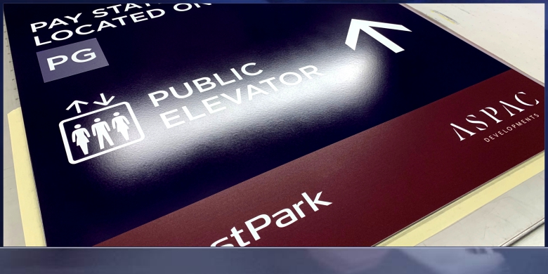
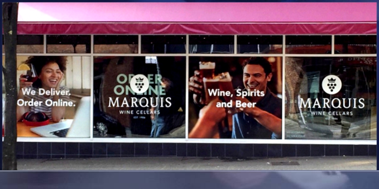
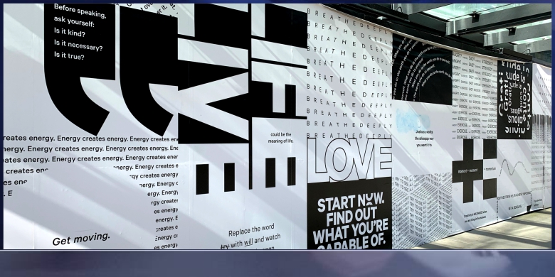
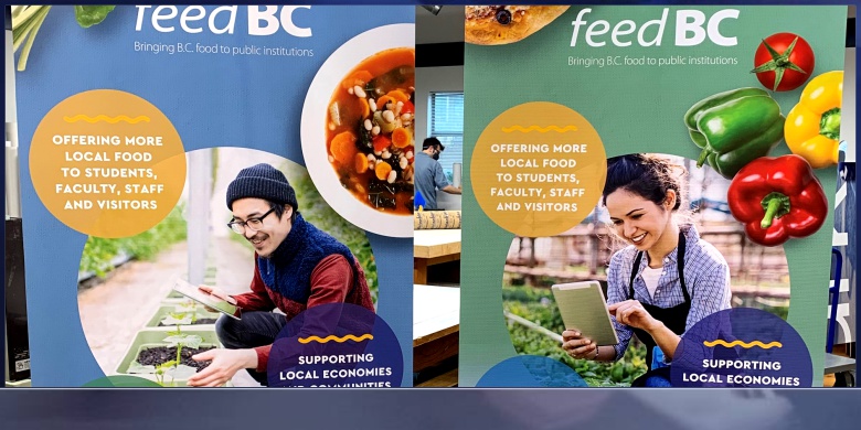
The key to ensuring your brand stands out from the rest? Powerful point-of-purchase (POP) displays. These are the end caps, shelf talkers, display stands, and other types of signage that highlights a brand’s products in order to sell customers on its benefits and value right there in the store. To ensure your brand’s POP / POS displays make your products stand out among those 80,000 competitors, we recommend following these six steps.


1. Speak to Your Audience’s Needs

Consumers generally aren’t looking for products with certain specs or features; they’re looking for products that solve their problems. Maybe that’s eliminating a pain point or making their lives easier in some way; maybe it’s boosting their self-esteem or impressing others or simply adding joy to their lives. As you create your POP / POS signage, and particularly the messaging it conveys, don’t lead with the latest bells and whistles but with the intangible value your product offers customers.

Additionally, be sure to consider the customer’s entire experience. While, ideally, your target audience is already familiar with your brand from your digital, direct mail and other advertising tactics, the shopping trip offers yet another channel to meet and engage with potential buyers during the customer journey. To make your brand stand out, devise ways to engage with consumers from the parking lot into the shelf with branded signage, POP / POS materials, and product coupons.

2. Design for the Specific Retail Location

When you’re creating display materials for multiple outlets — even multiple locations of the same store — remember that not all retail locations are created equal. Retailers will have different rules and guidelines. These guidelines could be based on space constraints. An elaborate floor display that looks beautiful in a large suburban location is likely to be a tripping hazard in a smaller store tucked into a compact, urban area.

Differing rules may also be driven by local laws. No matter how beautiful the design or how powerful the message, a store display that isn’t compliant with regulations is simply a waste of money. Consider working with a marketing supply chain partner that’s well-versed in retail parameters and industry regulations to ensure every piece of in-store signage is compliant and display-ready.

3. Keep Longevity in Mind

A torn-up, worn-out display is a turnoff to customers, so as you design your POP/POS signage, do so with durability in mind. Whether it’s a temporary display for the holiday season or a permanent installation, you’ll want to ensure it looks great as long as you need it to. Will it survive transportation and storage in pristine condition? If it’s a product display will it support the weight of the products? Will it withstand in-store traffic, including shopping cart collisions or purse bumps?

Additionally, you’ll want to ensure the display is easy to restock. Shelf-talkers that get in the way of shelf access or endcaps that are too complicated to easily refill may look great at first, but as product dwindles, they may not get refilled as often as necessary, leading to missed sales opportunities. (Remember, too, that if a display is complex to restock, it’s probably hard for shoppers to access as well and they may pass it by.) A durable, easy-to-maintain display will showcase your brand in its best light for a long time.

4. Ensure Prime Placement in Store

The real estate adage, “location, location, location” applies to in-store signage and displays, too. Once you’ve invested in high-quality, beautifully designed marketing materials, it’s important to ensure those materials are displayed where customers will see them. For example, the Shop Association notes that the sweet spot for signage height is between shoppers’ shoulders and knees. A sign that’s close to the floor isn’t likely to be seen, nor is an in-aisle ceiling dangler.

Also consider unexpected places to grab shoppers’ attention. Research says six in ten in-store purchases are impulse buys, so it may pay to place your displays in strategic places to pique those impulses. Place your products near the cash register to inspire last-minute buys, or near items they pair will with to entice customers. (For example, showcase your salsa on the chip aisle or package your spirits with fun bar accessories and coupons for popular mixers.)

(Note: Make that prime placement easier for everyone involved by ensuring your signage is delivered on time and easy to assemble.)

5. Minimize Production Costs

With tight marketing budgets and high ROI expectations, it’s important to ensure the costs of the POP / POS materials don’t outweigh their value. A savvy marketing partner can help find ways to minimize costs without sacrificing quality or effectiveness. Some of the levers you may pull to streamline costs include material selection, manufacturing techniques and complexity of design. Choosing a partner that gangs orders through “buy windows” and has a proven network of production facilities helps maximize economies of scale, saves costs, and minimizes risk. Knock-down displays — the kind that are shipped disassembled or flat and popped up in store — can save significant costs on packaging and transportation. The more creative you and your partner can be about design, materials, shipping, and ordering windows — without sacrificing quality — the more valuable in-store marketing will be for your brand.

6. Follow Best Practices for POP Display Design

Finally, to create POP / POS materials with maximum impact, be sure to follow the design best practices that are most likely to catch shoppers’ eyes and encourage them to choose your product. Select bold colors that both showcase your brand and evoke the feelings (comfort, safety, impulsiveness, etc.) you want buyers to feel. Select unique shapes that will stand out on shelves and against other displays, and ensure any interactive elements are intuitive for shoppers. Keep your messaging clear, simple, and easy to digest — and be sure your brand logo is on full display. Above all, keep the audience’s needs and experience at the forefront of the design process.

Please contact us for free information, tips and assistance!

Written By: Casey Rush  Source: One Touch Point Blog

Published in More Market Share
Page 1 of 2